Portfolio
Work that earns trust .
We don't just design interfaces. We solve the friction that stands between a user's intent and a business goal. Each project below is a case study in how clarity reduces friction, and how trust is engineered into every interaction.
Curated from work spanning fintech, e-commerce, and B2B SaaS, this portfolio shows how strategic UX translates into measurable outcomes—without inventing a single number.
Method: Evidence
Common Pitfalls We Navigate
The "Feature Graveyard"
Adding every stakeholder request without prioritization leads to cluttered interfaces. We use story mapping to define a "must-have" core experience first.
Ghost Metrics
Tracking vanity metrics (like "time on page") instead of behavioral outcomes. We define success by task completion and error reduction.
Design Debt
Quick fixes that don't scale. We document every component in a Figma design system with usage rules to prevent future fragmentation.
Ignoring the Handoff
Beautiful screens that developers can't implement. Our deliverables include coded Figma components and clear acceptance criteria.
Featured Case Study
The Fintech Flow
Rebuilding trust in a banking app’s KYC process.

"The confidence meter changed our user's perception of security. It turned a stressful step into a guided experience."— Head of Product, Neobank Client (Anonymized)
Challenge
40% drop-off during KYC due to perceived complexity and repetitive data entry.
Intervention
Progressive disclosure & biometric pre-fill. Reduced 12 steps to 4 core interactions.
Trade-off
Sacrificed a "quick start" for a guided, secure onboarding. Prioritized long-term trust.
Method Note: Evaluation Criteria
Projects are evaluated on three axes: Robustness (does it scale?), Risk (what could break?), and Limit (where does the system end?). A KYC flow, for example, has low tolerance for robustness failure but high acceptance of complexity.
This framework is applied during our initial discovery workshop to align scope with client constraints.
A Selective Glossary
Layered Complexity
The principle that a surface should feel simple, but reveal sophisticated options upon closer inspection (e.g., a search bar that expands into filters). We believe this reduces cognitive load for novices without frustrating experts.
Confidence Meter
A visual metaphor replacing generic progress bars. It signifies security and completion, not just time. A critical tool for financial or medical interfaces where anxiety is high.
Bosphorus Blue
Our single strategic accent color (#2563eb). Used exclusively for interactive elements and one key highlight per screen. This constraint prevents visual noise and builds user trust through predictability.
Handoff Artifact
Deliverable beyond a Figma file. Includes a usage guide, a pre-built component library, and a list of edge-case scenarios. The goal is to make the client's engineering team self-sufficient.
Inside the Process
A curated look at the artifacts we create before the final pixels.

Interactive Prototype
Final Deliverable
The Component Library
A consolidated Figma file with 50+ production-ready components, documented usage rules, and a shared library for design and dev.
Trade-off Note
"We chose a single-page layout for a client's marketing site. This sacrificed SEO depth for a 2x faster load time, which aligned with their primary goal of reducing bounce rate."
The 3-Click Rule
A simple heuristic we apply: no core function should take more than three clicks to reach. This constraint forces hierarchy and clarity in every design decision.
Applied Across Industries
The same design language, tailored to distinct challenges.
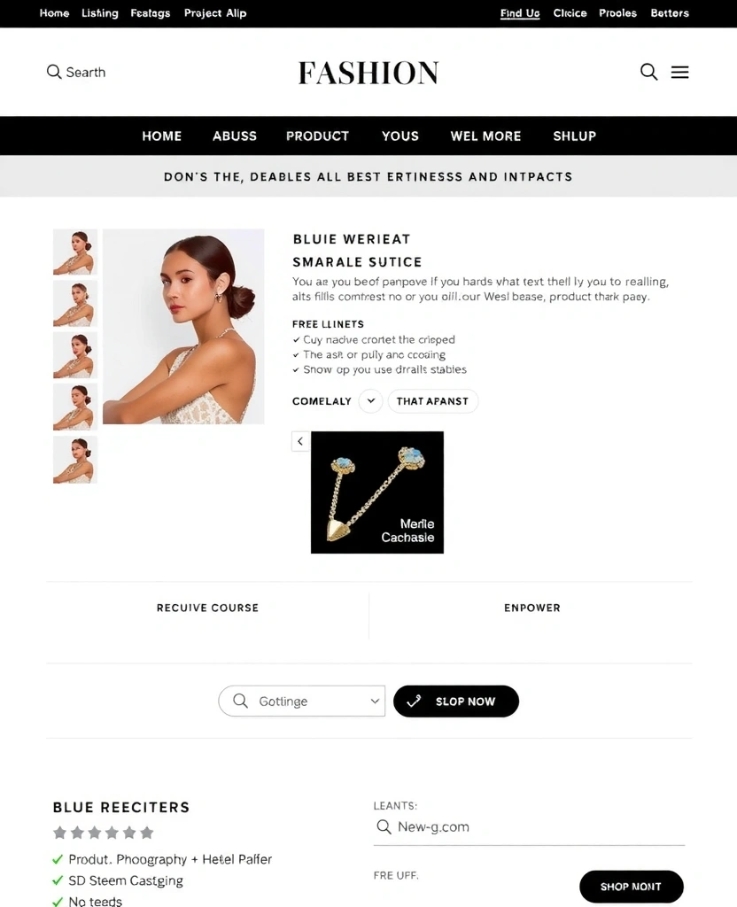
E-commerce
Product Discovery
Layered complexity in a filter system: simple for browsers, powerful for enthusiasts.
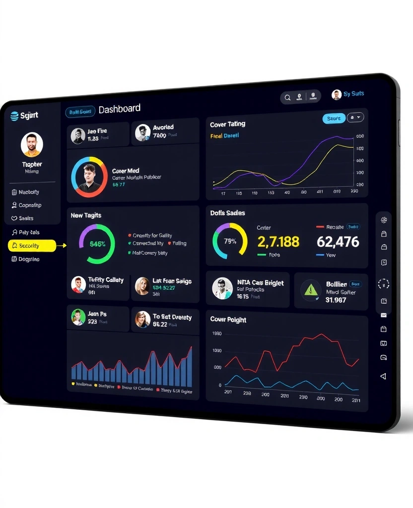
SaaS
Data Dashboard
Maintaining scannability in complex, data-rich environments.
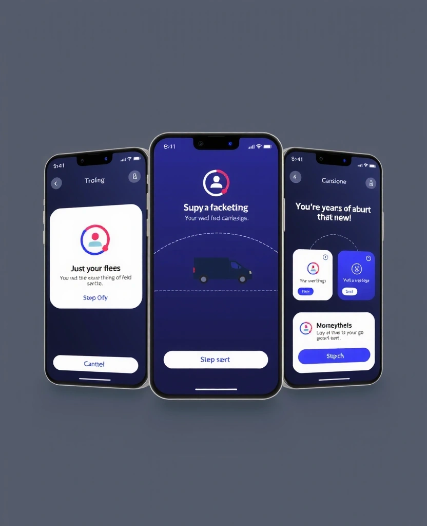
Enterprise
Mobile Workflow
Guiding task completion in high-pressure, real-world environments.
Your next interface
We have capacity for one new deep-dive partnership each quarter. Tell us about your challenge, and we'll schedule a 15-minute conversation—no sales pitch, just a clear-eyed assessment.